
New Covenant Brand Identity
Update a legacy church's logo and create a full brand identity so they can advance their presence in the community.
the challenge: REbrand a century old church
New Covenant in Clio, MI is the biggest Free Methodist church in their area and draws members from three separate counties. The church had been in the area in some form since 1936 but had bought a new building and converted to a more modern service style about 15 years ago. Now, they needed an updated logo to reflect their new goals and a brand identity system to give them credibility they'd been lacking.
the specs
Who I Worked With
Mark Dusseau
Barry Briggs
My Role
Visual Design (Primary)
discovery
persona needs
As a 100+ year old church now moving into the modern era, New Covenant had a complex customer base within their congregation and multiple conflicting user needs.
Staff: The church staff needed a logo that was clean, clear, and easy-to-use. They need clear guidelines on usage and an organized information architecture. Files needed to be set up for staff to make changes once I was no longer on the project.
Retired community: There was a large section of the congregation that was retired 60+ year olds, many of whom had been a part of New Covenant since before its transition. They wanted to make sure the history wasn't lost in the new branding.
Young families: Since the location and service style change, New Covenant had drawn in a large number of young families and singles in their 20s and 30s. They wanted to see branding and marketing materials that actually resonated with them.
Ideation
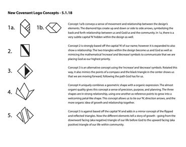
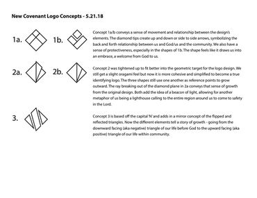
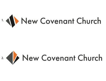
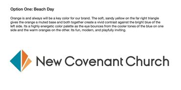
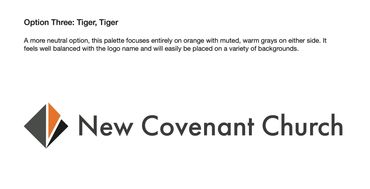
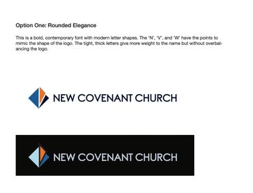
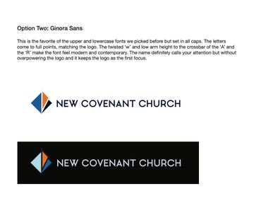
I generated over 30 potential thumbnail directions and selected five strong directions to present to stakeholders. Their feedback guided the next iteration as I narrowed in on the directions they liked best. I presented again with the goal that we'd select a final mark but stakeholders were stuck between two. I created a quick color mockup to help them visualize the final. From there, I presented color and font options and I had a final logo.
Concept work
Design
Key Features
Feature 1: Three Triangles
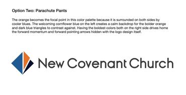
The three triangles tell a directional version of New Covenant's story: where they've been and where they're going with a ray above of holy guidance. The shapes mimic a ray of light and the turning page of a book to tell a story of hopeful change. The diagonal suggests cardinal points and the orange ray leads the eye up to true north to symbolize New Covenant's desire to be a beacon of renewal for their community.
Feature 2: Complimentary Color Scheme
The blue and orange create strong contrast that will stand out against various backgrounds for staff use. The orange in the center emphasizes the upward slash and moves the eye forward across the mark.
Feature 3: Ginora Sans font
It was important for the font's letterforms to mimic the clean geometry of the final mark. Ginora Sans in all caps had letters which came to clean versus rounded points to match the mark and the twisted 'W' and low x-height of 'A' and 'R' gave it a contemporary feel.
Brand identity
After the logo was finalized, I built out the rest of the identity system. These included:
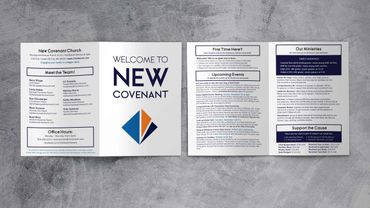
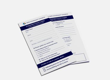
- editable bulletin and connection card layouts
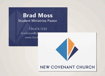
- business cards for staff
- signage system
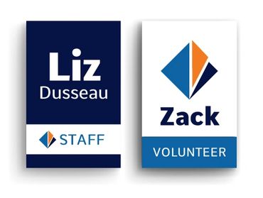
- name tags that easily identified various key team members i.e. staff, volunteer, or safety team
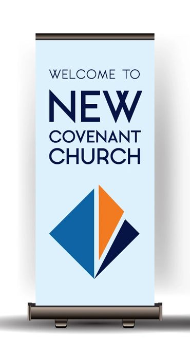
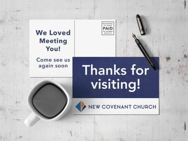
- various banners, flyers, and postcards
The brand is in use at New Covenant to this day and provides a versatile identity system for a growing spiritual community.
Copyright © 2024 Rachael Moss - All Rights Reserved.
Powered by GoDaddy Website Builder
This website uses cookies.
We use cookies to analyze website traffic and optimize your website experience. By accepting our use of cookies, your data will be aggregated with all other user data.