
Covenant Eyes Annual Report
Elevate a text-heavy annual report into a celebratory visual artifact for the company's stakeholders and potential investors.
the challenge: elevate a report into artwork
How might we decrease attention fatigue and increase the completion rate of the company annual report?
Covenant Eyes wanted to elevate their annual report with a strategic visual communication direction. The goal of this project was to make the document something that could be displayed proudly by employees and provide stakeholders and potential investors key information in a unique way so the company stood out from more traditional reports.
the specs
Who I Worked With
Grace Bolzman
Trent Reese
Jason Walker
My Role
Visual Design (Primary)
UX Design (Primary)
discovery
Where we started
Each year, the company identifies a thematic goal that drive all the department's efforts. 2020's goal was Spring Cleaning: a focus on organizing and streamlining internal processes in a company that had been heavily focused on its rapid external growth for the past two decades. I wanted the visual form of the document to be inspired by that pruning energy, paying respect to what Covenant Eyes was and embracing the possibilities of what it was becoming.
The discovery process also revealed that the report's information architecture and the team's project workflow were abysmally convoluted thanks to extremely tight timelines and lack of clarity around project ownership in past years. With stakeholder permission to increase scope, I also ran point on improving the project's structure so that future teams had clear starting points and processes.
IDeation
Working out design ideas
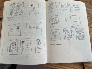
I generated more than 50 design ideas. Concepts ranged from revealing the bones of document design with visible grid structures overlapping the text to creating a progressive rhythm of color from grayscale to full color by the end of the document.
Final Concept: After stakeholder and expert feedback on all my concept work, I selected the idea of a Few Good Things. This concept explored how simplicity can feel just as celebratory and luxurious as extravagance.
Concept work
Design
Key features
Feature 1: Chaos to Clarity
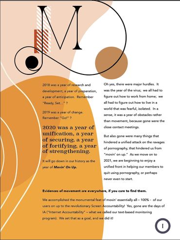
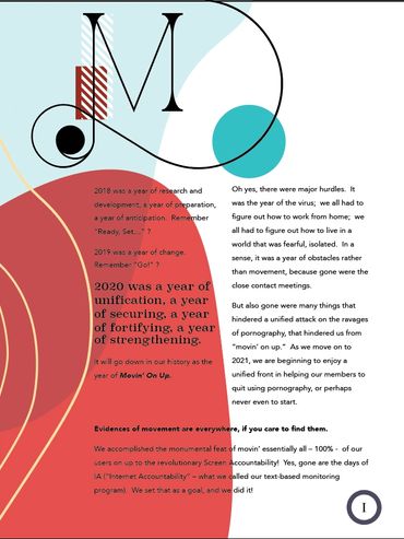
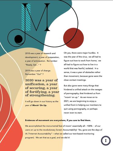
I built a four-part progressive rhythm into the book and matched these to the four sections of content. The document begins at chaos with a maximalism design aesthetic, triad color scheme, and overlapping design elements that press against each other and into the margins and then slowly simplifies into a minimalist layout with a monochromatic color scheme and restrained use of one or two design elements.
Feature 2: Van de Graaf Grid
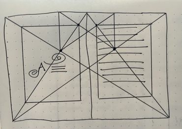
The idea of a Few Good Things wasn't to get to minimalism for the sake of austerity but to celebrate how carefully honed designs can enhance an experience. I looked to 15th century hand-drawn manuscripts as examples of precision and careful attention to key details. I chose a Van de Graaf grid to create the wide margins reminiscent of those manuscripts.
Feature 3: Modernized Illuminations
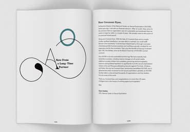
I continued the inspiration of medieval manuscripts through a modernization of monastic illuminations. I used organically shaped color blocks with overlapping transparencies and the Port Vintage decorated serif breaking across margins as a modern interpretation.
Feature 4: Tension though Proximity
I juxtaposed thin, organic lines against geometric trapezoidesque color blocks to create movement and tension as they overlap and touch or almost touch. These elements crowd into the text and margins at the beginning of the document and fall away as a user continues through the workflow. This creates an internal sense of 'space to breathe' as the user progresses through the document.
Four-Part Design Progression


project standardization
There was no documentation or standardized processes tied to this project even though it had been an annual project for over five years. I created documentation that outlined the agreed-upon timeline, listed the team members and their roles, and clarified the steps of work being assigned and completed.
The annual report's documents had to go through a three-part edited process and no editors could complete more than one of the three checks per document. I created a system logic to ensure that no editors duplicated and everyone on the team had visibility into where each document was at. Everyone was able to take ownership of the work and make sure it was moving forward efficiently.
conclusion
This was the most successful annual report Covenant Eyes had shipped to date. The streamlined process, timeline documentation, and clarity of roles saved over $4000 in labor and printing costs since I was also able to reduce the page count of the document through effective information architecture.
Copyright © 2024 Rachael Moss - All Rights Reserved.
Powered by GoDaddy Website Builder
This website uses cookies.
We use cookies to analyze website traffic and optimize your website experience. By accepting our use of cookies, your data will be aggregated with all other user data.